Section Component
A context-providing container component that renders different types of content layouts (Grid or Banner) based on section type.
⚠️ Important: This component provides section context to child components and handles responsive styling that adapts to its container width.
Usage
With Section Data
import { Section } from '@wlloyalty/wll-react-native-sdk'

const section = {
  type: 'GRID',
  name: 'Featured Content',
  tiles: [...],
  priority: 5,
}

function MyComponent() {
  return <Section section={section} />
}
Fetching by ID
You can also fetch a section by its ID. The component will handle loading states automatically:
import { Section } from '@wlloyalty/wll-react-native-sdk'

function MyComponent() {
  return <Section sectionId="your-section-id" />
}
Props
| Name | Type | Required | Description |
|---|---|---|---|
| section | TSection | No | Section configuration object containing layout type and content |
| sectionId | string | No | ID of the section to fetch. If provided, the component will automatically fetch the section data |
Note
Either section or sectionId must be provided, but not both.
Section Types
| Type | Component | Description |
|---|---|---|
| GRID | <Grid /> | Displays tiles in a responsive grid layout |
| BANNER | <Carousel /> | Shows Banner tiles in a scrollable carousel |
Grid Layout Behavior
The Grid layout type provides a responsive layout that adapts to different screen sizes:
- Mobile: Tiles display two-wide
- Desktop: Tiles display four-wide
Tile Sizing and Stacking
Each grid position can accommodate either:
- One full-size tile
- Two half-size tiles stacked vertically
Key behaviors:
- Tiles flow from left to right, then top to bottom
- No pagination or "view more" functionality - all tiles are displayed
- Half-size tiles should be placed in pairs to avoid layout gaps
- A single half-size tile between full-size tiles will create a gap
Layout Example
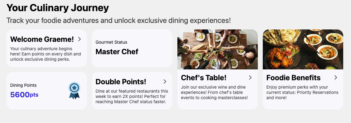
⚠️ Important: To maintain an optimal layout, keep half-size tiles paired together. Single half-size tiles between full-size tiles will create gaps in the layout.
Loading States
When fetching a section by ID, the component will display:
- A loading skeleton during the fetch
- An error message if the fetch fails
- The section content once loaded successfully
Context
The component provides a SectionContext with the following structure:
type SectionContextType = {
  sectionData: TSection;
};
Using the Context
import { useSectionContext } from '@wlloyalty/wll-react-native-sdk'

function ChildComponent() {
  const { sectionData } = useSectionContext()
  // Access section data here
}
Section Configuration Object
| Property | Type | Description |
|---|---|---|
| id | string | Unique identifier |
| name | string | Section name |
| type | 'GRID' | 'BANNER' | Layout type |
| title | string | Optional display title |
| description | string | Optional section description |
| tiles | Tile[] | Array of tile configurations |
| priority | number | Section display priority |
| active | boolean | Section visibility flag |
| pointsMultiplier | number | Optional points multiplier |
| pointsPrefix | string | Optional points prefix text |
| pointsSuffix | string | Optional points suffix text |
| locale | string | Section locale |
Styling
The component applies responsive styles with:
- 100% width
- Automatic horizontal margins
- Responsive bottom margin
Error Handling
- Logs warning for unknown section types
- Throws error if context is used outside provider
States
- Grid: Displays content in grid layout
- Banner: Displays content in carousel
- Unknown Type: Renders nothing with console warning